Color is a simple way to unify my work. I did go through a phase of bright, even bold colors. I still love Magneta, but I want softer colors. I am working on a calendar, quote posters, and much more! Right now feels like a good time to pause and reflect on my art.
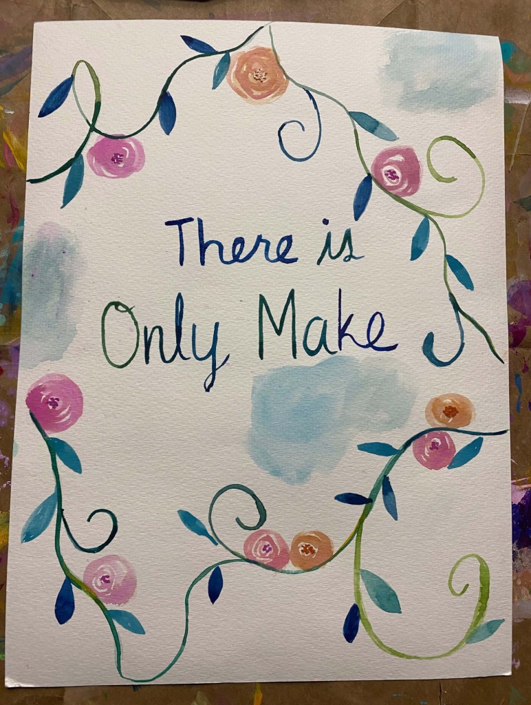
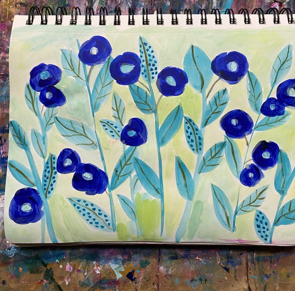
Is my art the art that I want to see in the world? Yes, I love my flowers and am excited to see the calendar of the 12 paintings I chose! I just want to unify my color palette and make sure I use colors that reflect what I want to express.
Happenings in Anthropologie
This is my favorite store. Let’s go over the details so you know why the colors and pottery capture me every time.
- monotones of green
- neutrals
- white flowers
- lots of small gifts like pottery and candles with cats or dogs
- large florals
- pink and burgundy
- blue gray
- florals and tea cup patterns
- florals that are one color
- simple quotes like I think I like this little life
- stripes
- vintage wallpaper floral patterns
- turquoise
Alright, now it’s time to pull out my colors and reference Ettavee’s color mixing tips.
Here we go!
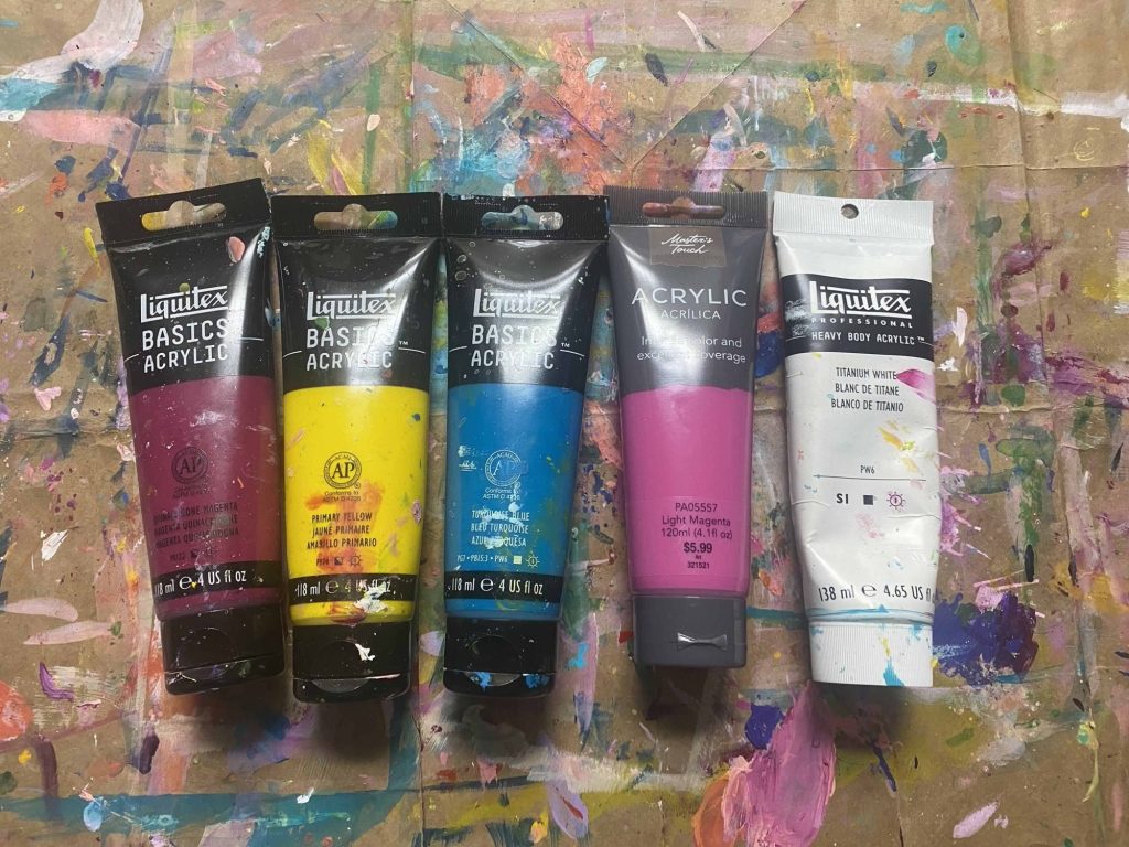
I sat down and began mixing. I did’t even mix on a palette. I was eager to see what I could do. With visions of beautiful colors I love and want to paint with, the magic began. I painted all these gorgeous colors by myself. Then I went back to Ettavee’s guide to mix some of the blues and greens.
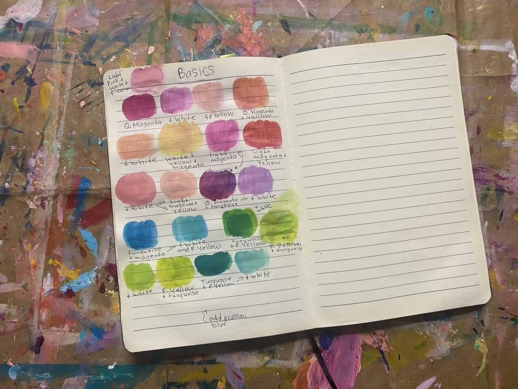
I still want more greens and a few yellows. I like adding a tiny amount of yellow to my white versus just mixing with titanium white. I also want to bring in Prussian blue. I do have Phalo blue. I wonder how the two compare. Ultramarine Blue?
Oh my goodness, look at all the colors I have mixed up with just five colors. I am going to do the same process with my premium set.
Thanks for being here!
