
I have been working on color. I finally figured out how to fix my color palette. In this post, I will share four color mixing tips that have simplified my painting process. I want to be like my students who pick up the paintbrush and paint.
My goal was to explore painting with my three primaries, a brighter color palette, and to create beautiful pinks. Now on with the tips and the best tool, you!
My Primaries and a few extras
- Quinacridone Magenta
- Turquoise
- Yellow Medium (this is my primary yellow by Liquitex Heavy Body)
- Titanium White
- The other Yellow I used for comparison is Cadmium Yellow
Tip #1 For Oranges use a Primary Yellow

There are many tones of yellow that you can buy. It is best to keep things simple with a primary yellow. The magical formula for mixing my favorite orange is
Primary Yellow + Quinacridone Magenta. These two colors create warm beautiful oranges. I indicated my favorite colors with a star. Begin with yellow and add the smallest amount of magenta. Try the opposite for even more colors. I am thinking of a yellow ceramic bowl I saw at Anthropologie. Let’s see if I can mix that color. I did!
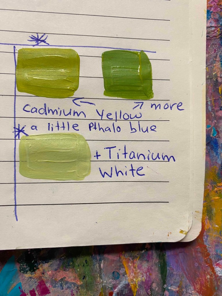
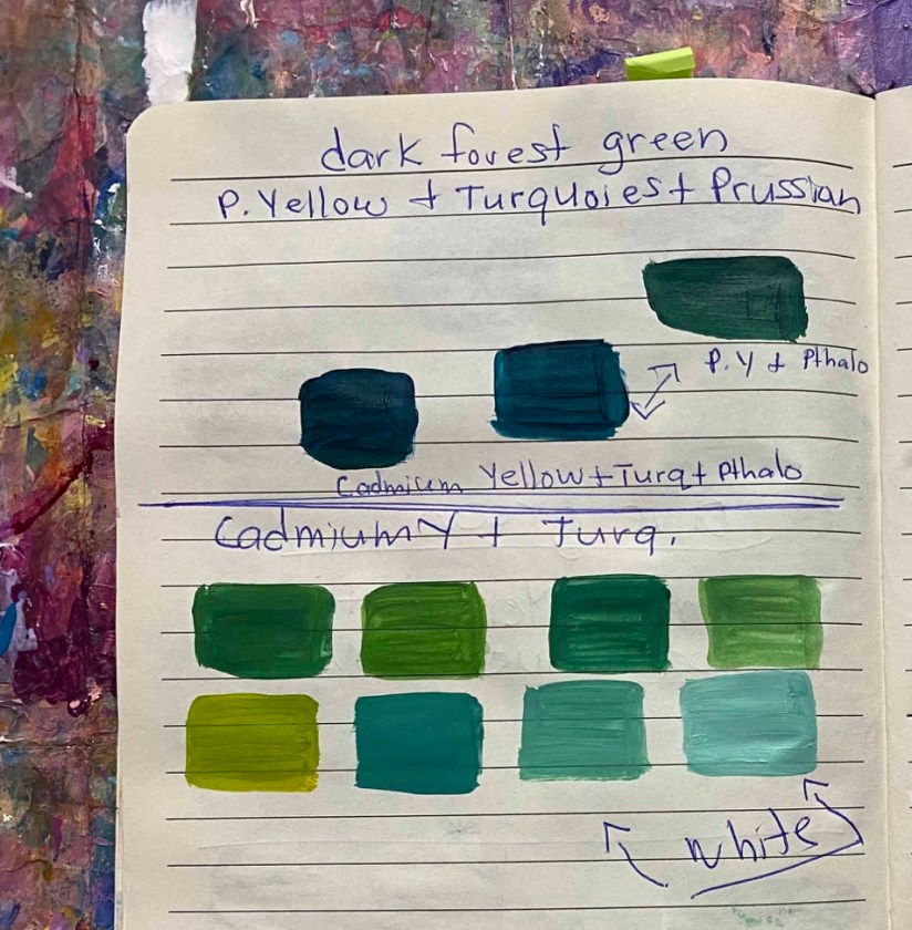
TIP #2 For Greens use Cadmium Yellow
If you are like me and obsessed with gold green, these two colors will take you places. Think of the beautiful backgrounds and leaves you can paint. Add a little Titanium White or Ivory and you have Pistachio green. You can mix a Dark Forest green. I did add a little phthalo blue. Phthalo blue is a neutral blue and a drop of it gives me a beautiful green.
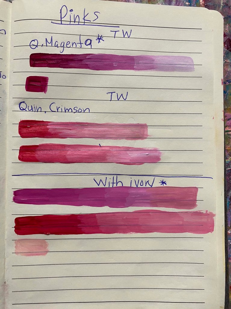
Tip 3 Quinacridone Magenta Makes Bright Pinks
Quinacridone Magenta + Titanium White is all you need. Add a little ivory to warm up your pinks. I put a star next to the colors that are my favorites. You can create even more pinks by adding a drop of yellow or it’s complimentary, Quinacridone Magenta’s complimentary is gold green? I think so.
Tip #4 The 80% Rule of Warm and Cool Colors
This realization is a game changer. Muddy colors happen when you don’t mix cool and warm colors in the following ratio.
80 % Cool 20% Warm (or do the opposite)
For example, I mixed Quinacridone Magenta with Turquoise in equal amounts and ended up with a muddy purple. Quinacridone Magenta is a cool color and Turquoise is a neutral color, so it’s amazing to mix with magenta and yellow but in small amounts.
Here’s a fun idea. Go to an Anthropologie store. This is a store filled with colorful clothes, ceramics, and other fun items. Walk through and listen to how certain colors make you feel. Then use the four tips to recreate your favorite colors. The most important part of your art is you. Paint what you like and enjoy the process.
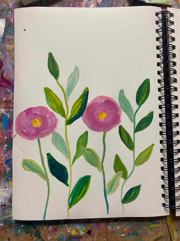
My color mixing helped me realize that I love warm colors. Now that I learned how to mix my favorite colors it’s time to finish my dragonfly and on to flowers.
I would love to see your color-mixing adventures. Comment below with a link to your website or social media. You can also tag me on Instagram @apaintedgarden
With Love,
Mireya

Leave a comment